Reviewing Proper Usage of CSS Units px, em, pt, rem

Hi web designers,
Let’s say you need to check how your web design has been implemented by a frontend developer. You need to make sure it looks as it should, responsiveness works, and all animations are as you intended. Accessibility is also crucial.
But let’s start from the beginning.
A Brief Intro to CSS Units
I won’t delve into the details of various CSS units here (there are many), but a brief overview can be beneficial. There are absolute units and relative units.
In terms of absolute ones, the most popular is pixels (px). You can be sure that user or browser settings won’t affect them.
However, pixels are not the best choice if we aim for a fully responsive and accessible website. Here come units: em (based on the parent’s font size), rem (based on the root font size), vh (based on viewport height), and others.
I believe this overview will suffice for the purpose of this article. If you wish to explore further, there's no better place than the MDN page: MDN CSS Units.
But Can't I Just Use Pixels Everywhere?
There is a reason why CSS has 15 relative units!
Let’s consider the rem unit. It’s the size of the root element font size. You might wonder why it’s not an absolute unit. Isn’t there a standard font size used on all browsers and devices? Well, no. The default value is 16 pixels, but users can modify this size in their browser or phone settings (typically under accessibility or screen settings).
Why does it matter?
Let's say you want your visitors to be able to read text on your website. Of course, it's not all as simple as that, so if you want to learn more about this topic, you should check out this great article: Pixels vs. Relative Units in CSS: Why It's Still a Big Deal.
Design Review, Remember?
Testing whether a frontend developer used the proper font size (with the proper unit!) during design review can be a really tricky task. I don’t expect you to be familiar with how browser developer tools work, so I have an easier solution for you: PageShare.
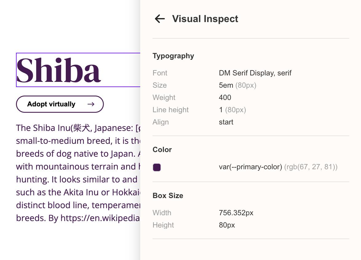
We have a built-in visual inspection tool for you, web designers, as a part of our bigger solution (visual feedback & bug tracking for web apps). Simply click on a text you want to check, and we will show you all relevant CSS values in two forms: original (how they were written, e.g., in em units or as a variable) and absolute (in pixels, depending on your device).
You can also check whether the font family has been properly loaded and more.
It’s free to use and available as a Chrome extension for download from the Chrome Web Store.
If you want to learn more about how PageShare works for web designers, visit our website.
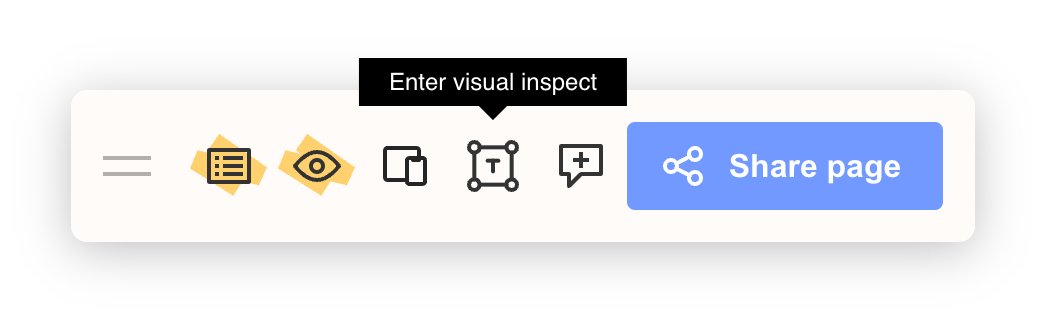
Tip: Enable our extension on the page you want to test and click the "Visual Inspect Tool" icon on the navbar (screenshot below).
Happy collaborating!